NOMADNOOK
CASE STUDY


CASE STUDY
Born out of conversations with exasperated digital nomads struggling to discover ideal workspaces whilst travelling, NomadNook is an app designed to elevate the remote working experience. Tailored specifically for digital nomads, NomadNook provides a unique solution for remote workers, offering curated accommodation and third places, recommended by and for fellow remote workers.
To design an app that helps remote workers find places to stay and places to sit and work while they’re travelling that are suitable to their needs. This application provides the ability to locate co-working spaces and third places as well as suitable accommodation, globally with the help of public data, reviews, and community insights to create recommendations.
Figma + Miro
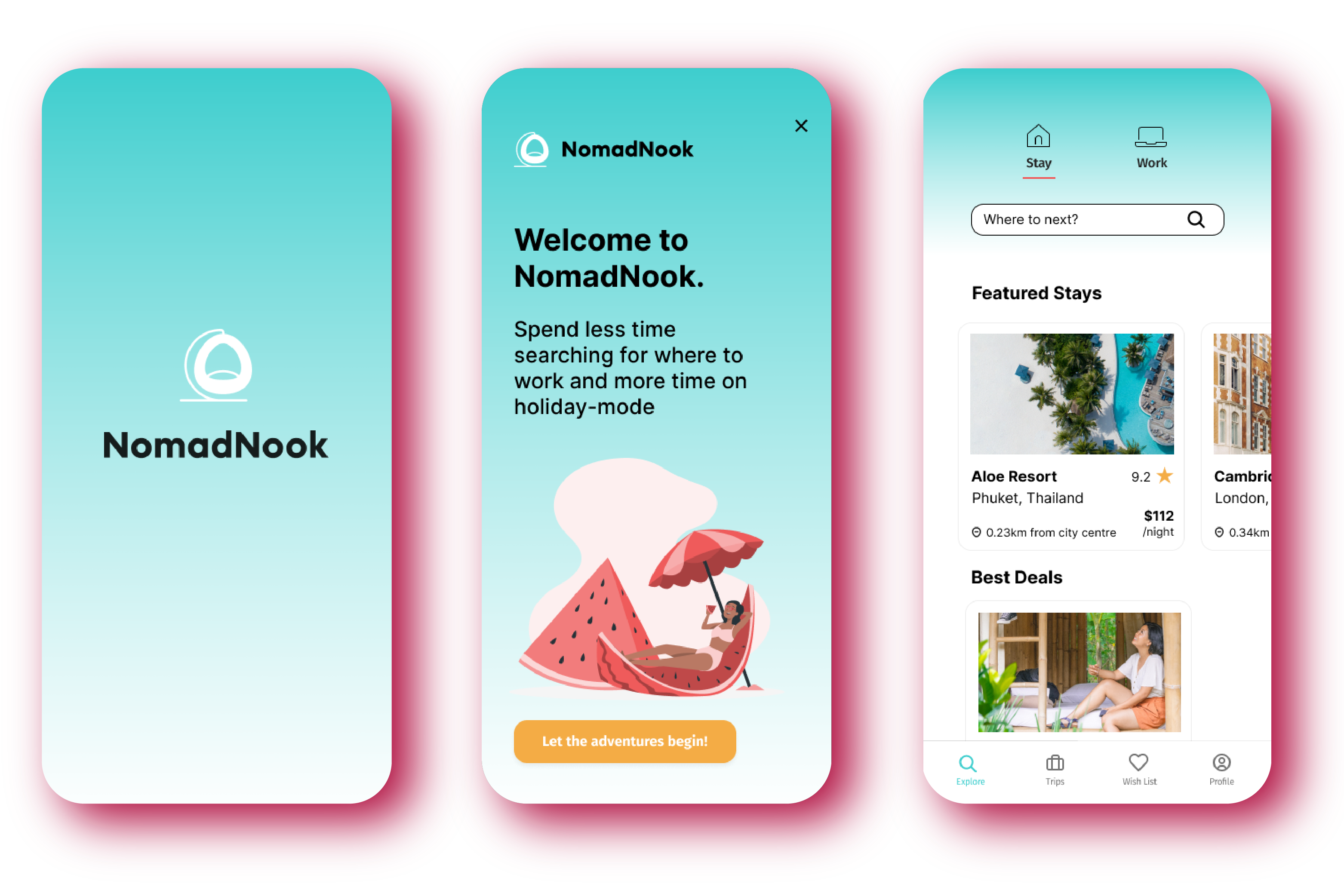
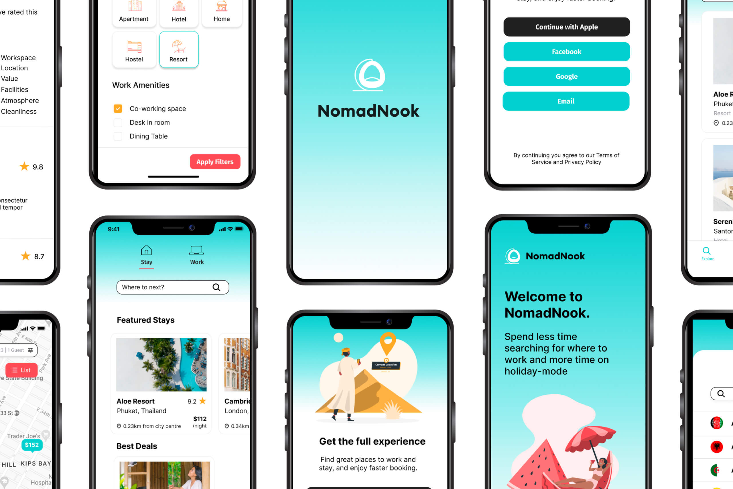
Lo-Fidelity Mobile App Prototype.
Four week project timeline
It all started with the research question:
What are the difficulties or frustrations participants face when using existing tools for booking remote worker friendly accommodation and co-working spaces?
I conducted a diverse set of 6 user interviews to delve into the challenges faced by those working remotely while travelling. The participants, ranging from 22 to 56 years old, offered a broad perspective through a mix of virtual and in-person interviews. These individuals, who travel a minimum of 4 weeks domestically and/or internationally, contributed diverse backgrounds from various cities and countries, enhancing the sample and providing a comprehensive understanding of users' varied needs.
"...because I’m a remote worker, [I'd like] a specific feature with specific reviews from the remote working community. Or even a filter to find accommodation with a proper co-working space."
"I’m not one of those people who travels once a year and just spends it all and it’s okay. Because I travel often I have to be more careful [of my costs]."
"Sometimes... you’ve seen these beautiful pictures of the place, and they say that it’s a good place to work and good wifi, and then when you arrive, you don’t have any connection and you struggle to download your documents or work online."
An affinity diagram was created to categorise interview data into 15 distinct categories, offering a comprehensive understanding of users' diverse needs. The resulting insights emphasised the demand for an app recommending spaces suitable for remote work, incorporating reviews from fellow remote workers.

NomadNook addresses the challenges faced by travellers balancing work and leisure, seeking ideal remote workspaces. The goal is to minimise disruptions caused by unsuitable environments, allowing users to maximise productivity and leisure time during their travels.

Most remote workers seek accommodations and third places with fast wifi, a dedicated workspace, and a comfortable, aesthetically pleasing environment for productive remote work while traveling. The uncertainty around meeting these criteria led us to believe that developing an app with tailored recommendations, exclusively featuring remote worker-friendly spaces and user reviews, would significantly benefit users. Our goal is to streamline their experience, allowing them to focus on work and enjoy their trips without the worry of workspace suitability.

To structure and visualise my concepts for this app, I employed the dot brainstorming method, honing in on the most promising ideas. Seeking input from a panel of digital nomads, I utilised dot voting to distinguish preferred options. Blue dots, chosen by interviewees from the research phase, and grey dots representing my own favorites, provided a clear visual guide for selecting the most promising ideas.
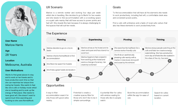
I crafted a user journey map to empathize with users and anticipate their needs while using the app. Recognising the potential urgency in users seeking quick solutions, the sign-up process was tailored to be flexible, allowing users to defer it until later. This empathetic design approach aims to save users valuable time, especially when urgently searching for remote worker-friendly accommodations on the go.

The Value Proposition Canvas proved instrumental in articulating and refining NomadNook's unique value by examining customer needs, jobs to be done, and associated pain points. This process clarified design objectives for both third places and accommodations, laying the groundwork for a compelling, user-centred solution.
The following features emerged as immediate focal points for implementation:
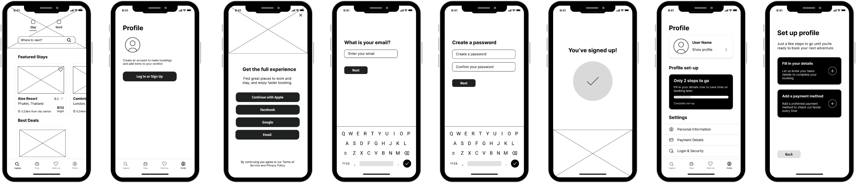
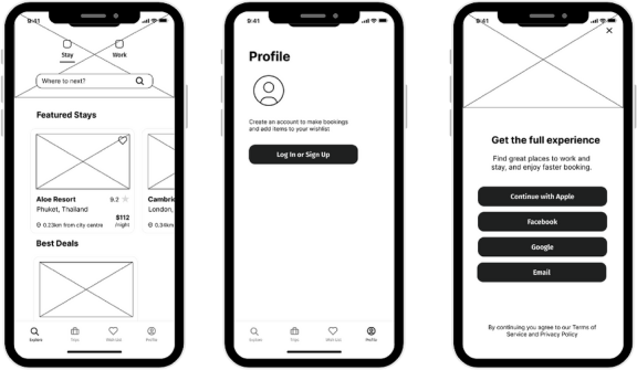
Every prototype begins with a user, and this project was no different. Before touching the design tools, I wanted to make sure that the onboarding process had as few steps as possible, and as much user freedom as possible.
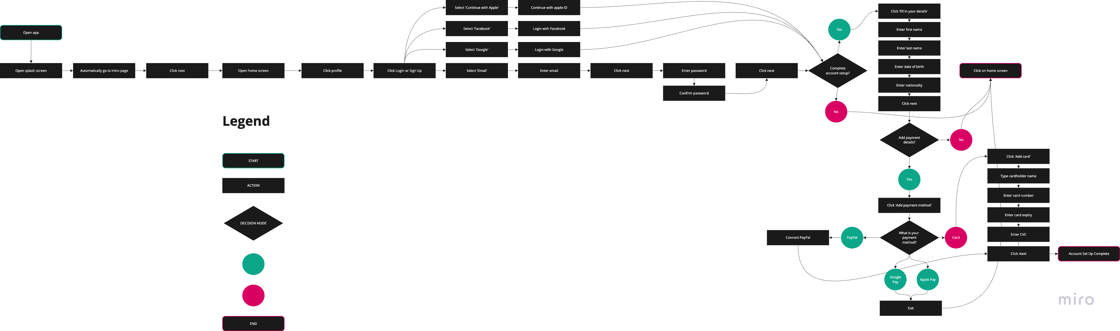
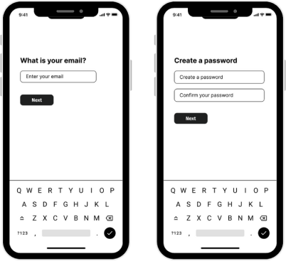
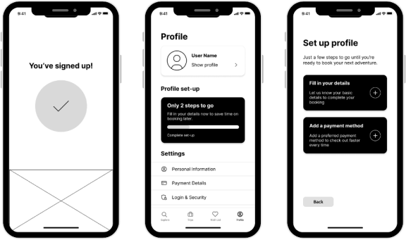
It was a conscious decision to allow users to have the choice of browsing before signing in. Users are able to navigate to the onboarding process in the profile tab. I wanted to keep the sign up process as simple as possible and self-paced. There is no differentiation between log in and sign up - the email input checks against existing users to determine the next step. Users can choose to fully set up their account now, or to come back to it later when making a booking. The app lets you know how many steps to go and breaks it down to avoid overwhelming the user.
I conducted five usability tests with users, using the moderated remote testing methodology via Zoom.
All users were able to at least partially submit each task, with the key issue being in finishing profile set-up.
Improvement 1: Make the profile set up steps more obvious
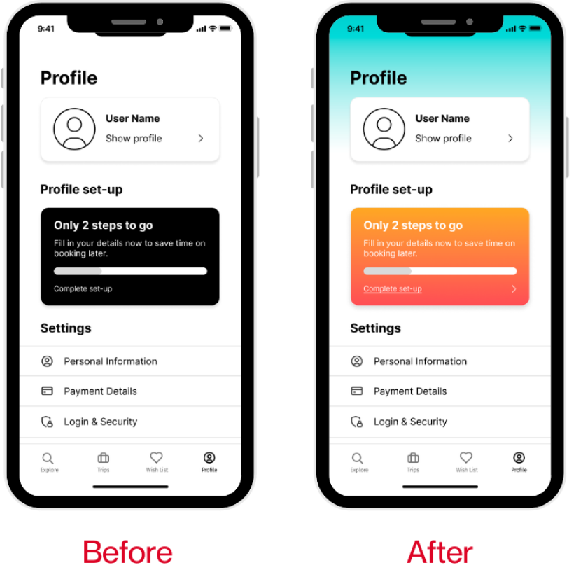
Problem:
During usability testing, this step was the one most stuggled with (3 out of 5 users). They initially clicked on the ‘show profile’ link, not realising that the ‘only two steps to go’ button was clickable.
Solution:
To solve this problem, I added an underline to ‘complete set-up’ and an arrow to denote an action to be taken.
Improvement 2: Making the filters page less text heavy and more scannable
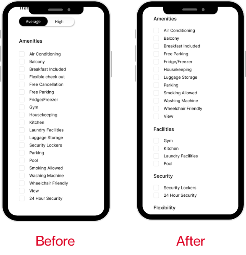
Problem:
Two users mentioned that they felt that the amenities section of the filters was difficult to scan through visually as there were a lot of text options.
Solution:
To solve this problem, I added split up the amenities into four categories so that it was easier to scan and find what one was looking for.
Improvement 3: Making the reviews easier to find.
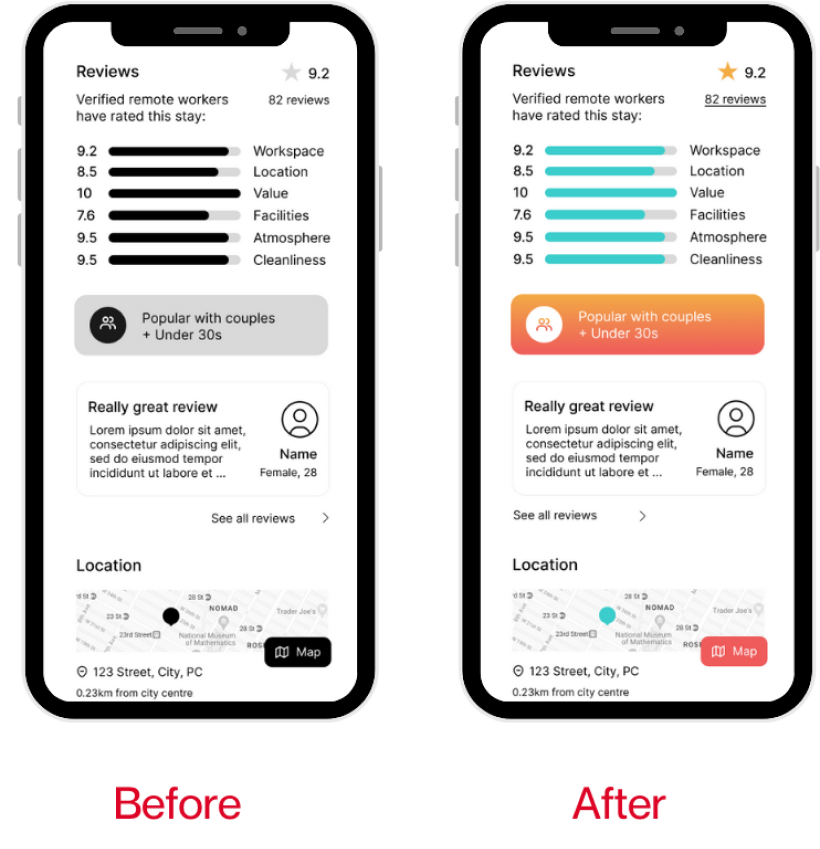
Problem:
One user noted that it was difficult to find the link to read the reviews.
Solution:
Left aligned the ‘see all reviews’ button and linked the ‘82 reviews’ to the reviews page, and linked the rating at the top of the page, which now makes three links available to the user.
Play with the final prototype here:
This project was born of a problem that many of my friends and I faced whilst travelling as remote workers, and really ignited a passion within me to create something to help people to enjoy their adventures whilst balancing with productive work.
Upon reflection, I acknowledge the importance of emphasising the 'work' aspect of the app. I realised that this focus would be a key differentiator, especially considering the saturated market of travel accommodation platforms. While the app incorporates unique filters and features tailored to address the specific challenges faced by remote workers, I found myself constrained by certain conventions to maintain user familiarity. Disappointingly, I received feedback comparing the app to Airbnb, which diverged from my original intention to create a truly distinctive platform.
The next steps in this process are to build out the other side of this app, and to only look at competitors when iterating for the sake of problem solving, so that I can see what unique ideas my brain can come up with without the influence of others in the first prototype. This will also need to be tested and iterated.
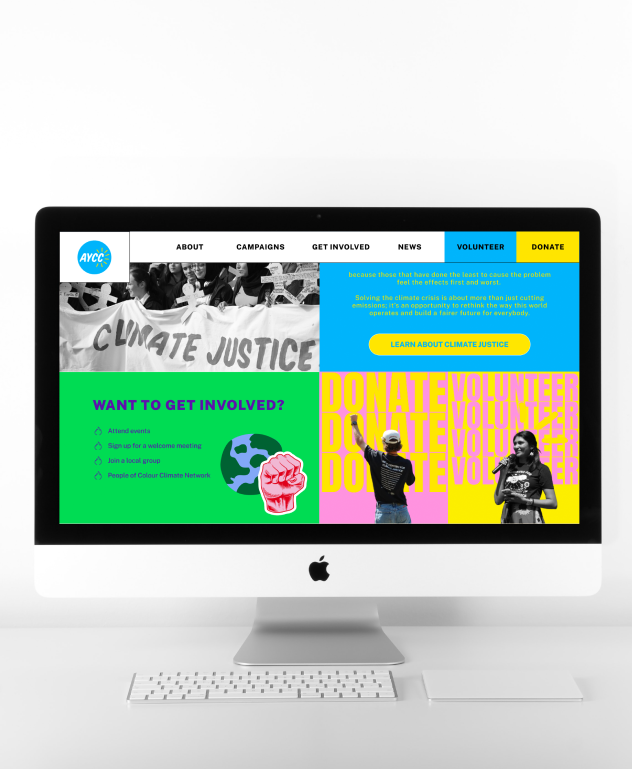
A revamp of the website for the Australian Youth Climate Coalition—a not-for-profit organisation with a powerful mission. Our goal was to infuse the site with a youthful, vibrant energy that resonates loudly and leaves a lasting impact. Join us in this endeavour as we aim to not only enhance the visual appeal but also drive increased volunteer sign-ups, igniting a wave of change in the fight for climate justice.
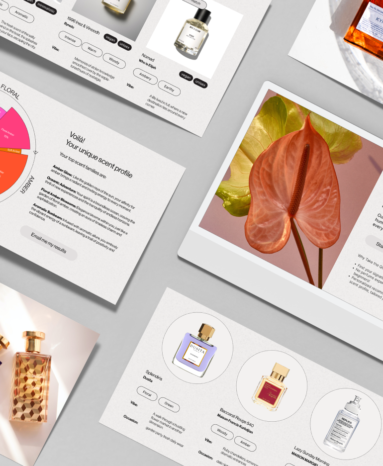
Introducing Arômes, a fragrance discovery platform that revolutionises the way individuals navigate the expansive realm of scents. Arômes simplifies the process with a user-friendly interface, incorporating a tailored quiz to match preferences and personality. We avoid confusing perfume jargon and provide straightforward, professional guidance.
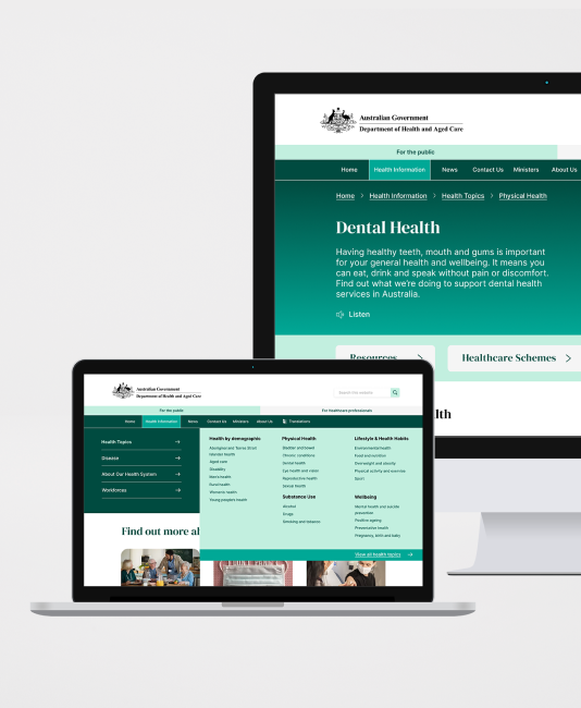
Introducing the redesigned health.gov.au website—a user-centric solution to the navigational challenges plaguing the national health authority's online presence. By reorganising content with intuitive categorisation and employing strategic design elements such as colour, spacing, typography, and imagery, users can now effortlessly locate and digest essential health information.

