AYCC
CASE STUDY
CASE STUDY
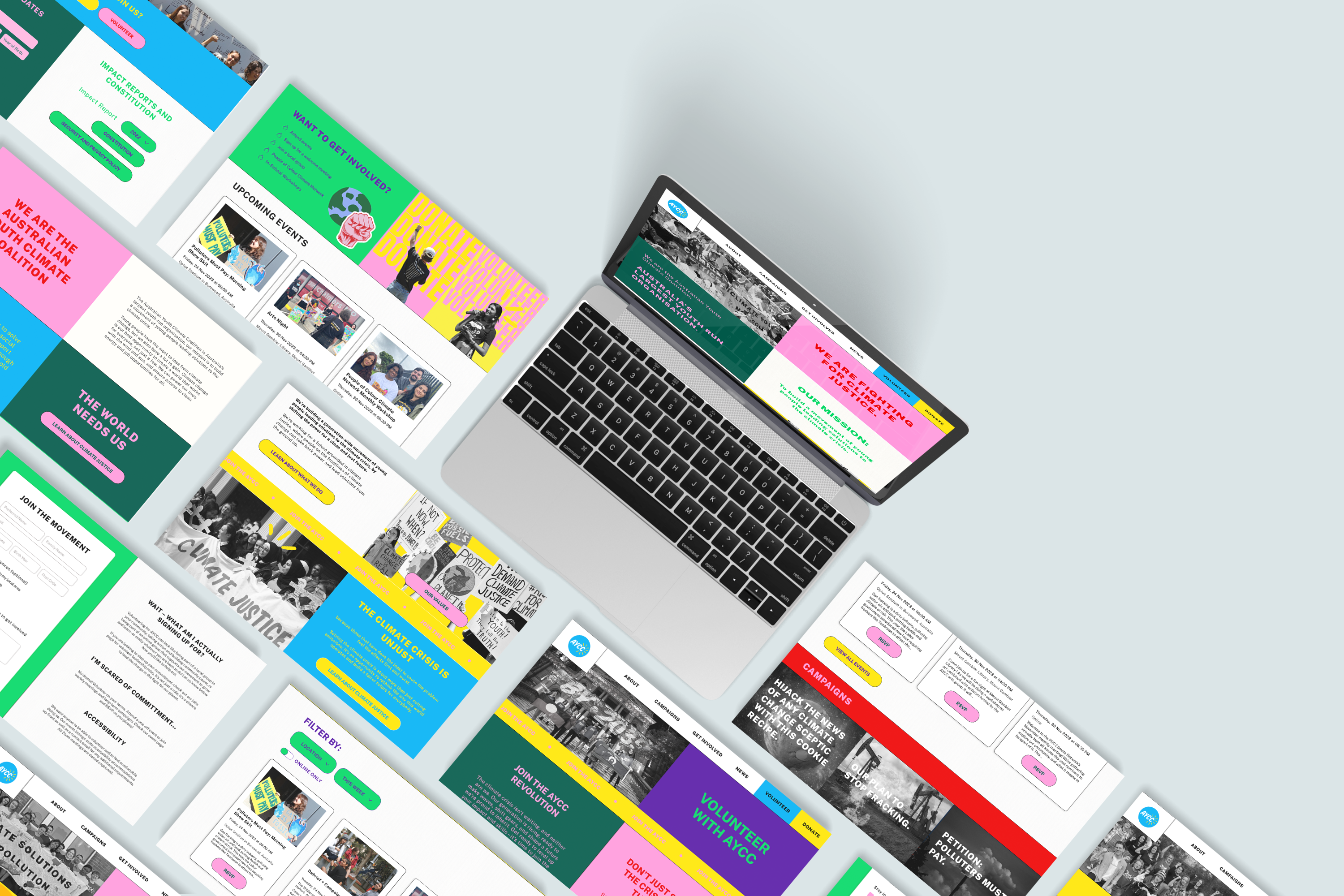
After having volunteered with the AYCC in my youth, this revamp of the website for the Australian Youth Climate Coalition—a not-for-profit organisation with a powerful mission – was also a passion project. Our goal was to infuse the site with a youthful, vibrant energy that resonates loudly and leaves a lasting impact. Join us as we aim to not only enhance the visual appeal but also drive increased volunteer sign-ups, igniting a wave of change in the fight for climate justice.
To create a visually appealing and intuitively designed platform that not only communicates our values effectively but also encourages users to commit to our cause, driving volunteer sign-ups through streamlined and engaging interactions.
Figma + Miro
High fidelity desktop and mobile prototypes.
Two week project timeline
Elizabeth Reid
Rebecca Vuurman

We boiled it down to two main questions:
What does it take to convert someone from an interested volunteer to a committed volunteer?
How do users feel about the AYCC website as it currently stands?
We conducted 6 user interviews with users from various volunteering backgrounds, ranging from committed volunteers to those who only volunteer once in a blue moon. We also set up a survey which had 10 respondents gather insight into the ways that people find volunteer/charity work and identify any potential obstacles to getting involved.
In our user interviews, we conducted testing on the existing website to determine what they do great, and what could use an update.
Lack of time as well and lack of information about the time commitment are the biggest barriers to volunteering.
Unprofessional and outdated website designs can lead to skepticism and reduced trust in a non-profit organization.
Providing individuals with various ways to get involved with non-profit organisations is crucial.
Accessibility needs to be clearly communicated and increases positive feelings towards organisations whilst breaking down barriers to volunteering.
We started with an affinity map categorised our interview notes into the following categories, which helped us to identify the problems we needed to tackle:
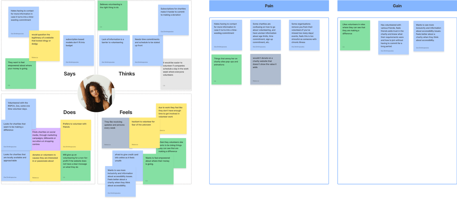
We've observed that many people would like to volunteer more often, but struggle to do so through a lack of clear information about the volunteering commitments. Those interviewed said that they have researched places to volunteer in the past, and have been deterred by unprofessional and seemingly untrustworthy websites, as well as unclear outcomes, leading them to rely on recommendations from friends when choosing not-for-profit organisations to support.
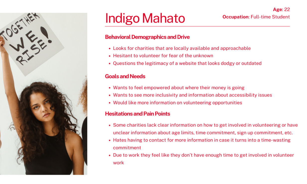
Users would like to volunteer more often, but struggle to find the information they need about volunteering opportunities. They want to support the causes that they believe in, but distrust organisations that fail to demonstrate tangible outcomes and that don’t present themselves in a professional manner.
We recognise the need to see an organisation’s impact communicated clearly through their website as well as greater transparency on volunteering expectations.
We conducted a SWOT analysis on the existing website and discovered the following strengths and weaknesses. Combined with a competitor analysis on the following organisations’ website, we distilled our opportunities as shown.



When redesigning this website, we had to consider our audience: 12-30 year olds. A quote from our user interviews helped to steer us in this loud, bright and youthful direction: “The organisation is gonna be loud because they're going to be campaigning for something”. We wanted to capture attention and send a message whilst still retaining the essence of the existing AYCC brand.
Aside from our stylistic refresh, we had a few top priorities when it came to what additional sections and information to include. Our goals were as follows:
We wanted the interaction design to be playful and youthful. The keywords in minds were ‘loud’, ‘vibrant’ and ‘playful’ when considering which interactions we would use to create an enjoyable and memorable experience through the website.

We dubbed this hover effect ‘the highlighter’, highlighting points of interest.
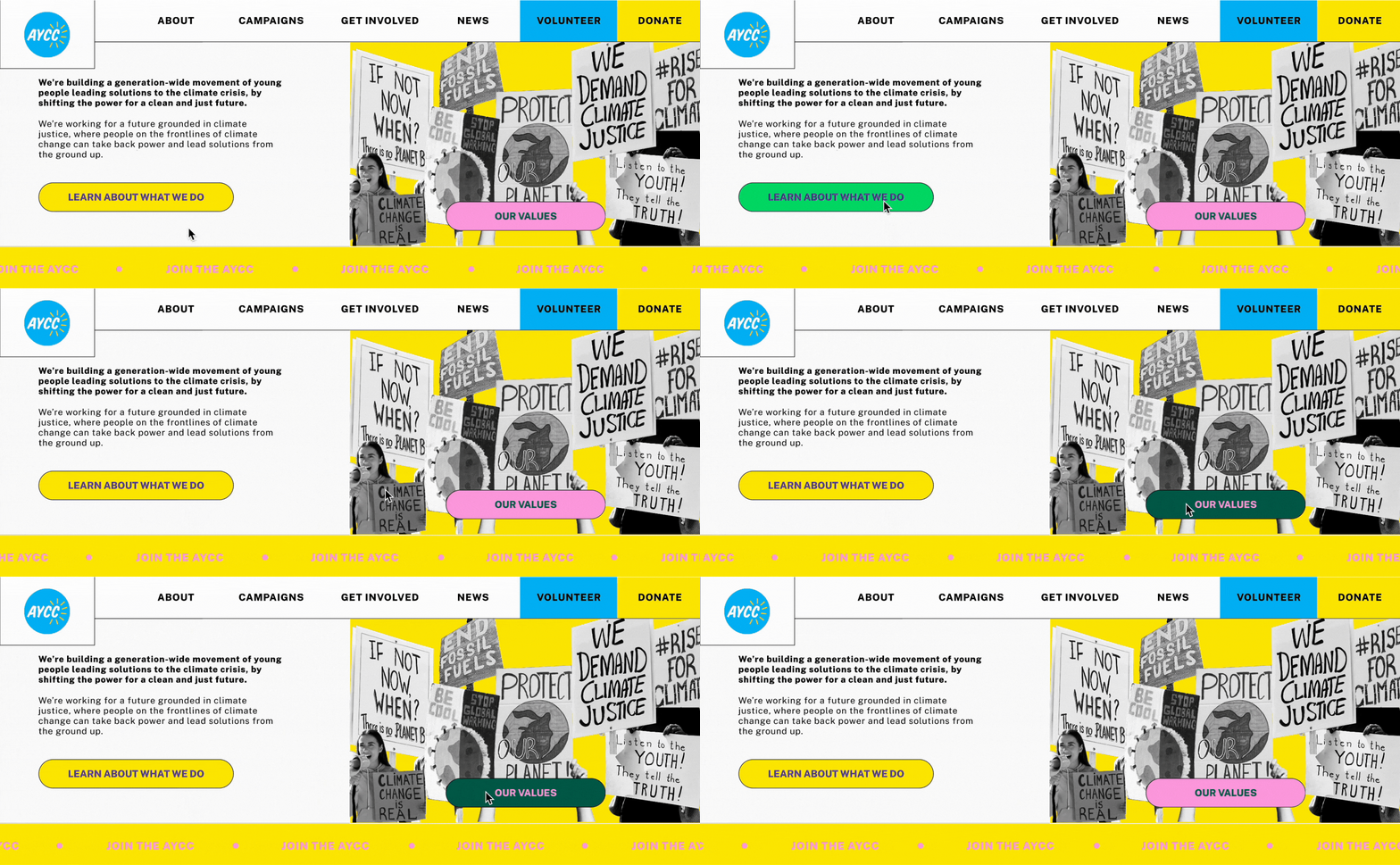
We used infinite scroll text to draw focus to our main call to action, whilst also peppering additional buttons to the volunteer sign up page throughout.

Loud text, colours and iconography communicate what we would like users to do. The fire icons along with the highlight effects show how users can make a difference.
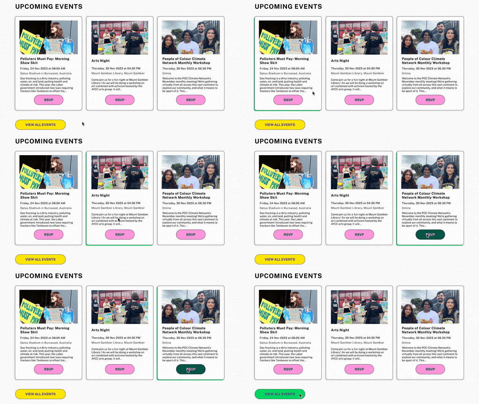
Our image cards have a playful hover effect consistent with our highlighter effect, making events seemingly pop off the page.

Campaigns are initially in black and white and come into vibrant focus on hover.

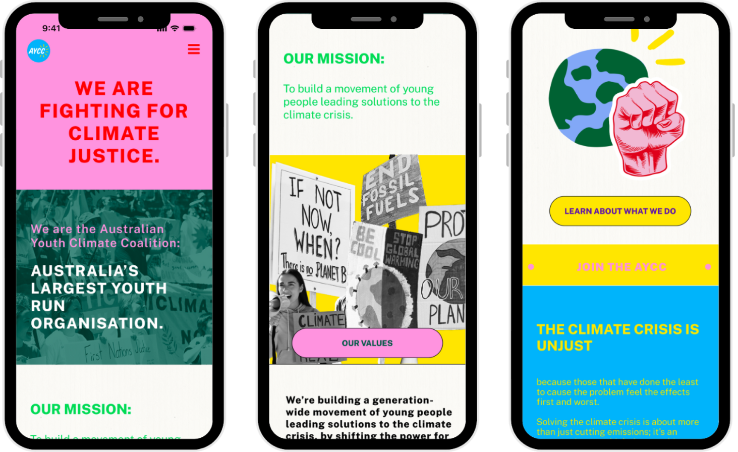
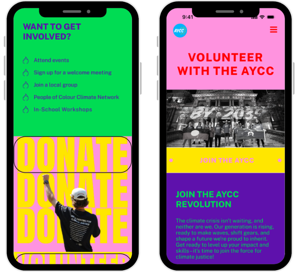
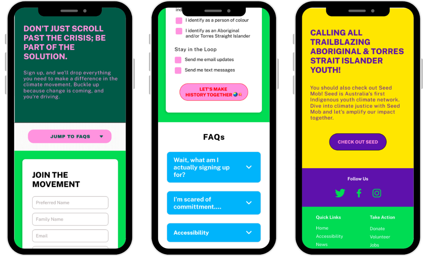
We conducted two rounds of five usability tests with users, using the moderated remote testing methodology via Zoom.
All users were able to complete all tasks, with the main feedback being to draw more focus to the main calls to action and improving the event filtering system.
Play with the final prototype here:
In the journey of crafting this UI design, we discovered that embracing responsive web designs isn't just a checkbox; it's the heart of a user-friendly experience, especially for our youthful audience. Ensuring a seamless mobile design became our mission, recognising that this generation is on the move, quite literally! Another colourful revelation was the impactful role colours play. They became the storytellers, grouping related information and turning our calls to action into vibrant invitations. Buttons didn't just stand out; they practically danced for attention! We had a lot of fun playing with hover states and interactions in this design, and it taught me that sometimes, daring design choices really do pay off.
Our next steps would be to build out a page for past projects and achievements, called “Our Impact” to show users the real impact of the organisation to continue to drive volunteer sign ups. We would also like to perform A/B testing on the sign up form to improve the process of signing up for volunteering. Finally, we also want to consider creating a sensory-friendly option of the site that users can choose to switch to if they find the original site overwhelming.
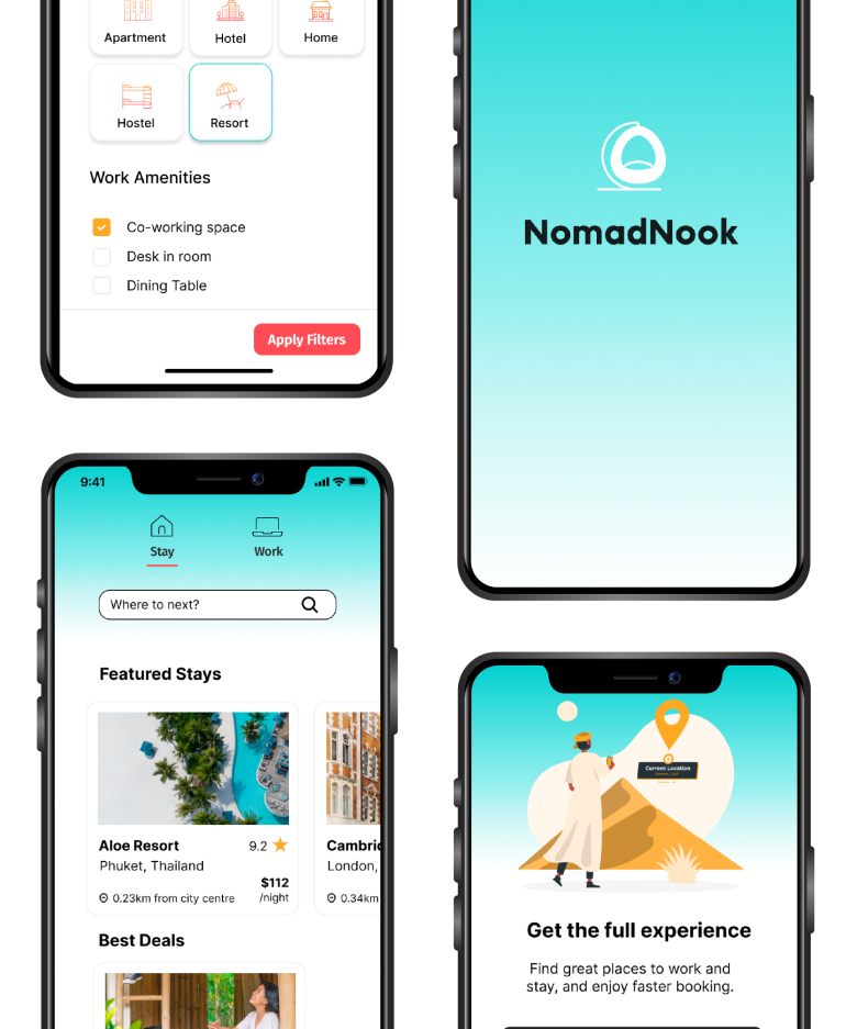
NomadNook is an app designed to elevate the remote working experience. Tailored specifically for digital nomads, NomadNook provides a unique solution for remote workers, offering curated accommodation and third places, recommended by and for fellow remote workers.
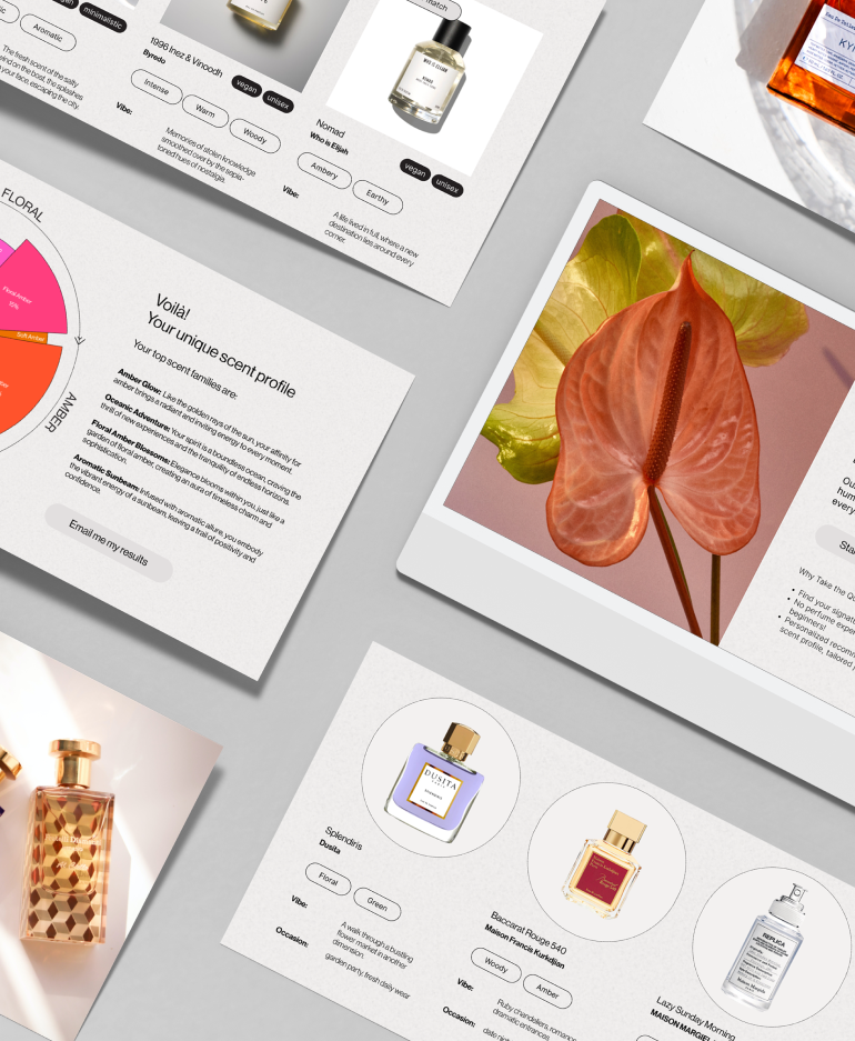
Introducing Arômes, a fragrance discovery platform that revolutionises the way individuals navigate the expansive realm of scents. Arômes simplifies the process with a user-friendly interface, incorporating a tailored quiz to match preferences and personality. We avoid confusing perfume jargon and provide straightforward, professional guidance.
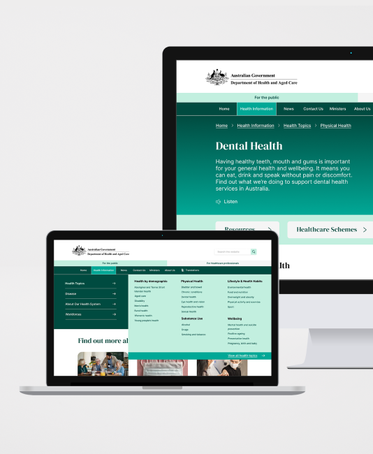
Introducing the redesigned health.gov.au website—a user-centric solution to the navigational challenges plaguing the national health authority's online presence. By reorganising content with intuitive categorisation and employing strategic design elements such as colour, spacing, typography, and imagery, users can now effortlessly locate and digest essential health information.

