AROMES
CASE STUDY


CASE STUDY
A UX/UI and front-end development project to design an online personal fragrance discovery platform that not only educates users on fragrance notes in a user-friendly manner but also leverages innovative techniques to understand and match individual preferences, providing a reliable and enjoyable experience for users exploring the world of fragrances online.
Our goal is to revolutionise how users explore, learn about, and find personalised fragrance recommendations online, ensuring a delightful and tailored journey in the vast world of fragrances.
Figma, FigJam, VS Code, GitHub
A responsive hi-fi prototype, and a coded home page.
Total project timeline: 3 weeks
Cala Barrett:
User Research Lead, UI Design
Hayley Morgan:
User Experience Design Lead, UI Design, Illustrator
The questions we were focussed on in our research was:
What difficulties or frustrations do participants face when using existing tools/methods to purchase perfumes online?
What are the key issues with the virtual fragrance shopping experience?
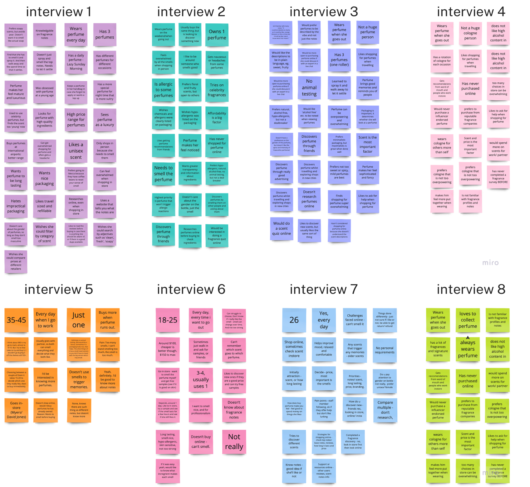
8 interviewees ranging from ages 20–50, who currently live in the Asia Pacific Region. They needed to purchase personal fragrances. The interviewees were a mix of genders to broaden the user testing pool.
Since we are prioritising the current user experience and due to 55% of women having a 55% share in the fragrance market, they were “overrepresented” in our sample.
We also conducted a survey with 19 questions to get quantitative data with results from 10 participants. A greater research sample is needed, however given the time constraints was unable to be accomplished..
Users don't know much about fragrance notes but do want to learn more
Due to the lack of information and guarantee of product satisfaction, they avoid purchasing online
Users feel overwhelmed by the number of smells, number of options and amount of information in store
Users have many personal preferences when it comes to perfume and need the ability to filter for their preferences and get detailed results
"“I don't know that many scents... it could be labeled as clearly as it could be... and I'd still be like I don't know what that means”
“Describing the smell not only with its ingredients, but with, I guess, a vibe saying with words that the general public know. Like it's sweet, fruity, this, that, and the other... I need a lot of description and descriptive words”
“No explanation, the lack transparency on the label is just like really confusing. It's all branding.”

say they have little to no knowledge of perfume scents and notes

would like to learn more about perfume scents and notes
We conducted a brainstorming session, and used dot voting to decide which ideas to implement. We chose the following:

A user persona was created to get an idea of the needs of our users and why they may be coming to Aromes.
Savannah needs a platform that will help her discover what personal fragrances she likes. She has difficulty understanding fragrance notes and finding recommendations on brands and fragrances.
During user research, we discovered that a majority of users struggle to find personal fragrances that match their preferences. They are overwhelmed by experience of in-person shopping and feel uncertain about making online purchases without smelling the fragrance.
We believe we can help by developing an online perfume discovery platform that educates users on fragrance notes in a user-friendly manner and leverages innovative techniques to understand and match individual preferences, providing a reliable and enjoyable experience for users exploring the world of perfumes online.
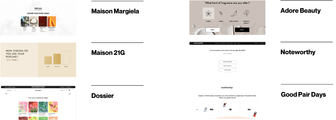
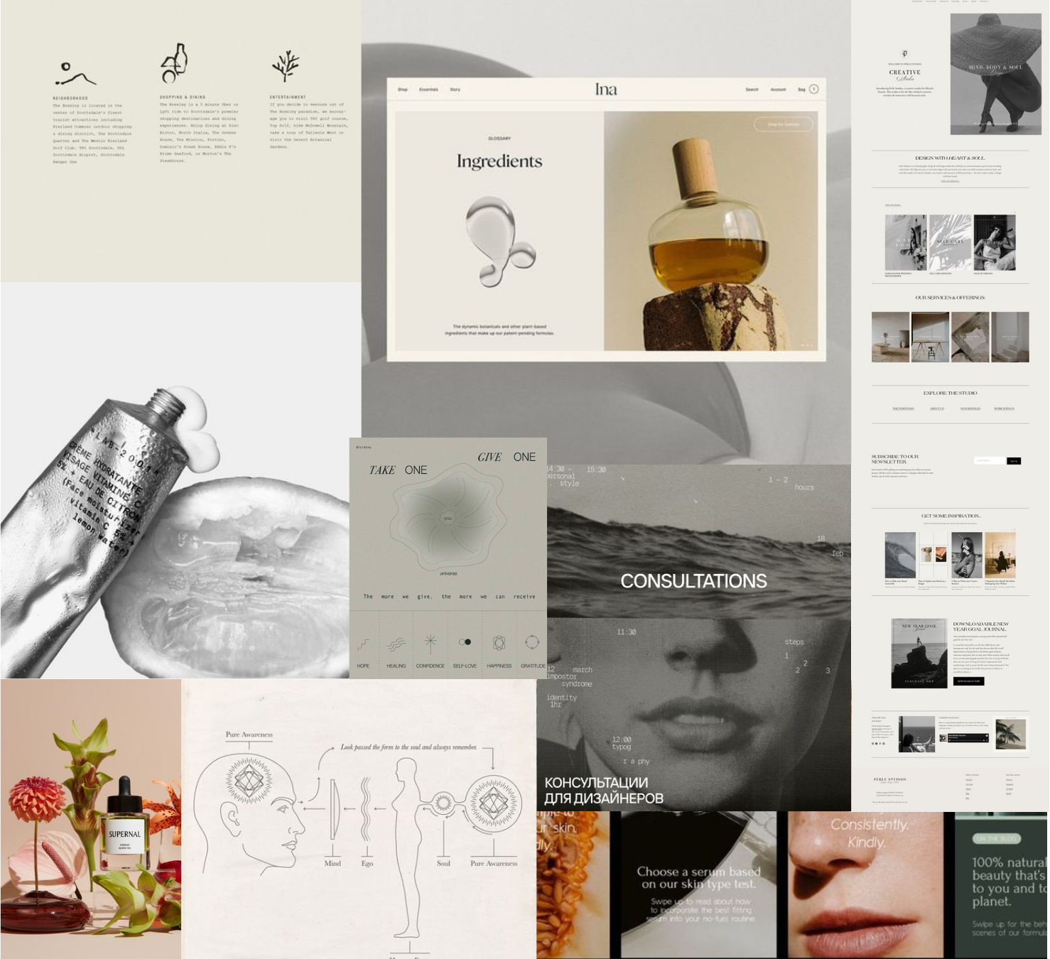
Since the beauty industry is heavily saturated, this helped us to understand our position in the market place and identify areas where we can prioritise improvement. We decided to analyse, primarily, scent discovery quizzes, to see where we could improve upon what existed. We found that quizzes were limited, high-level, and used fragrance jargon or zoned in on one small part of the overall picture. We also decided to analyse a non-fragrance competitor who had succeeded in our goal of taking a nuanced and complicated product and creating a relevant quiz using layman’s terms.
The direction that we wanted to take was very minimal and sophisticated. There were several reasons for this direction, including that in interviews, users told us that wearing perfume made them feel sophisticated and, so we wanted to match that feeling in the experience. Another reason was that we know the topic our website is tackling is information-heavy, and users described feeling overwhelmed. We wanted to keep a soothing, calming aesthetic and colour scheme to minimise those feelings. Finally, the addition of hand-drawn touches is to add some playfulness and approachability.


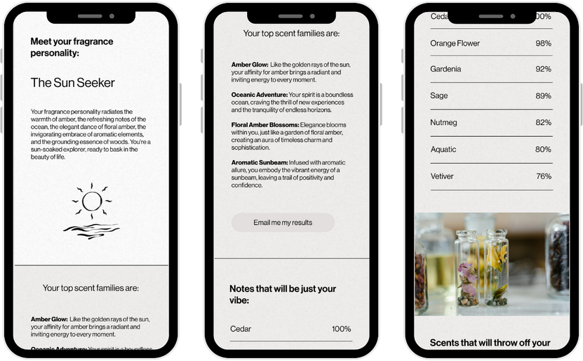
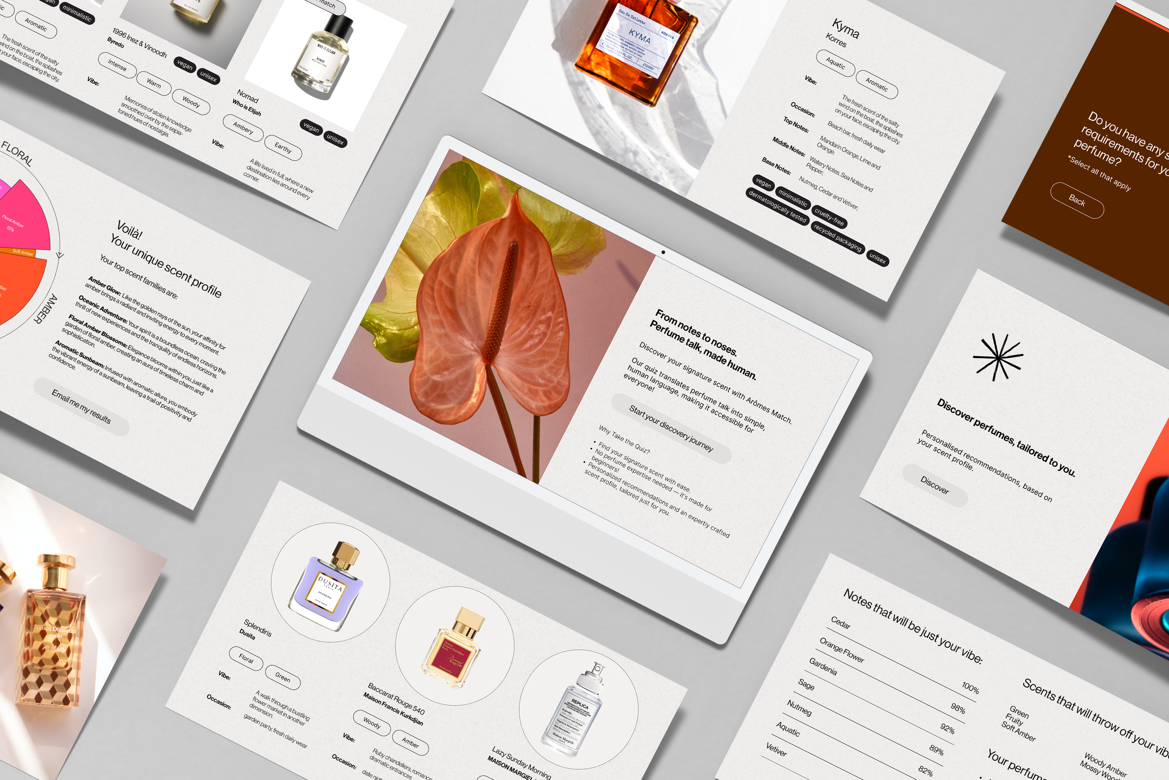
6 distinct categories of questions were used to create a comprehensive profile and recommendations. This created a well-rounded questionnaire that gathers users' personal preferences and personalities.
A user flow was created to wrap our heads around the mammoth task of creating this quiz, with offshoots dependant upon certain answers.
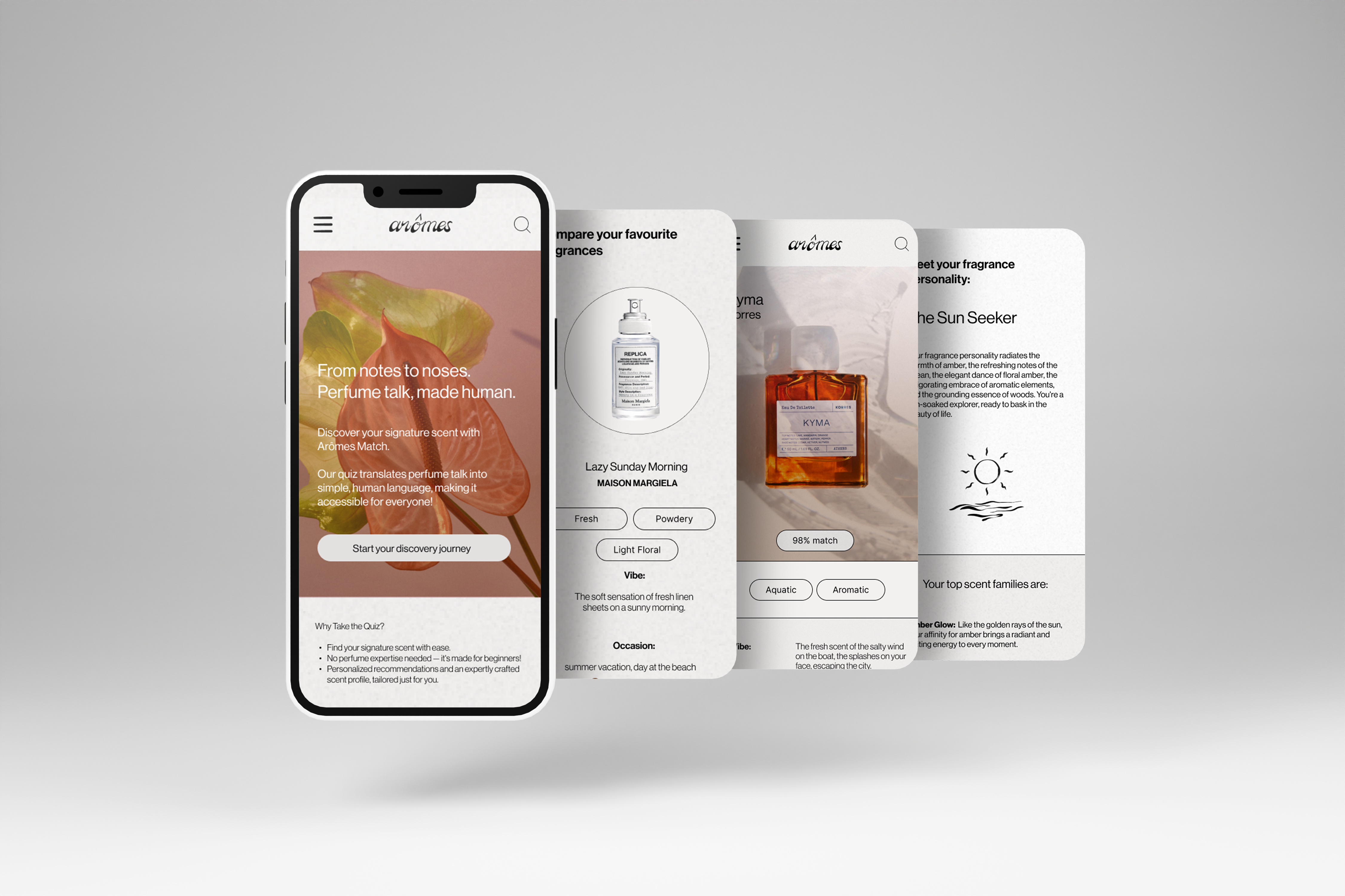
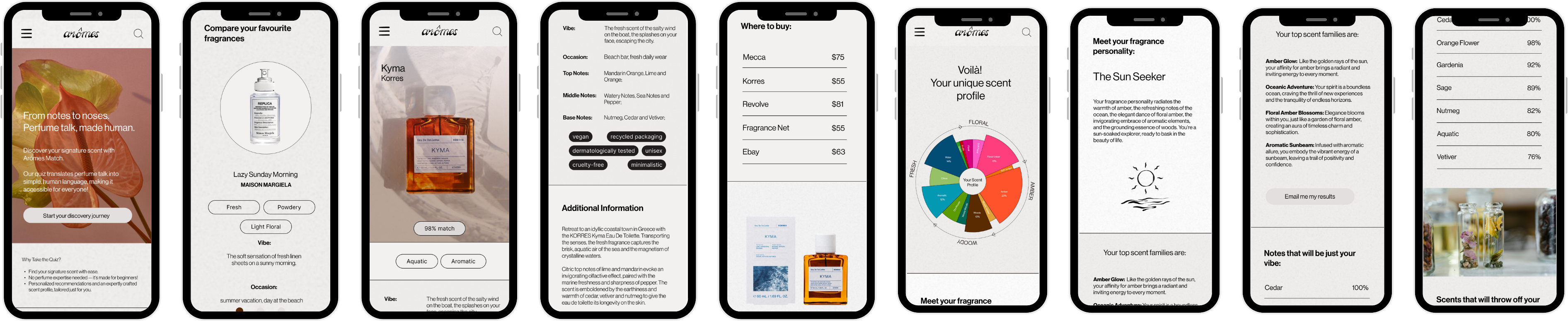
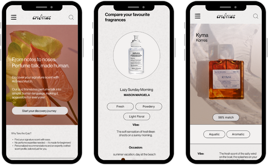
Quiz
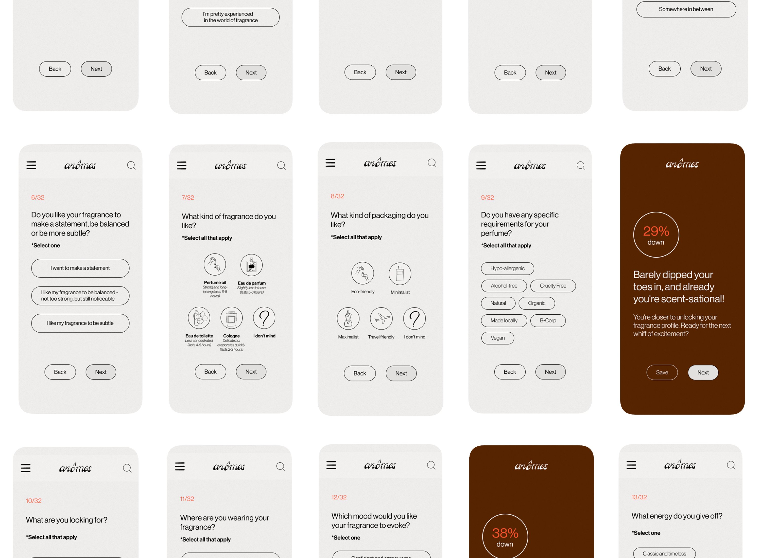
Features added:
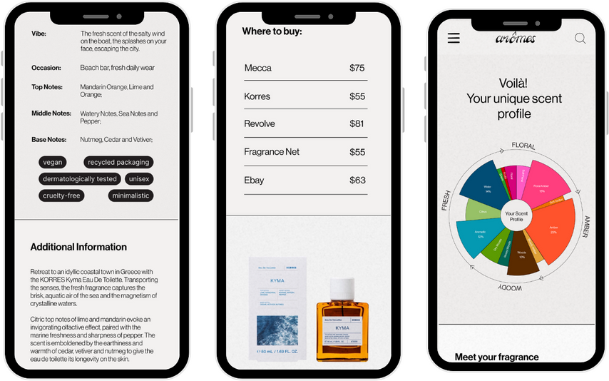
Scent Profile
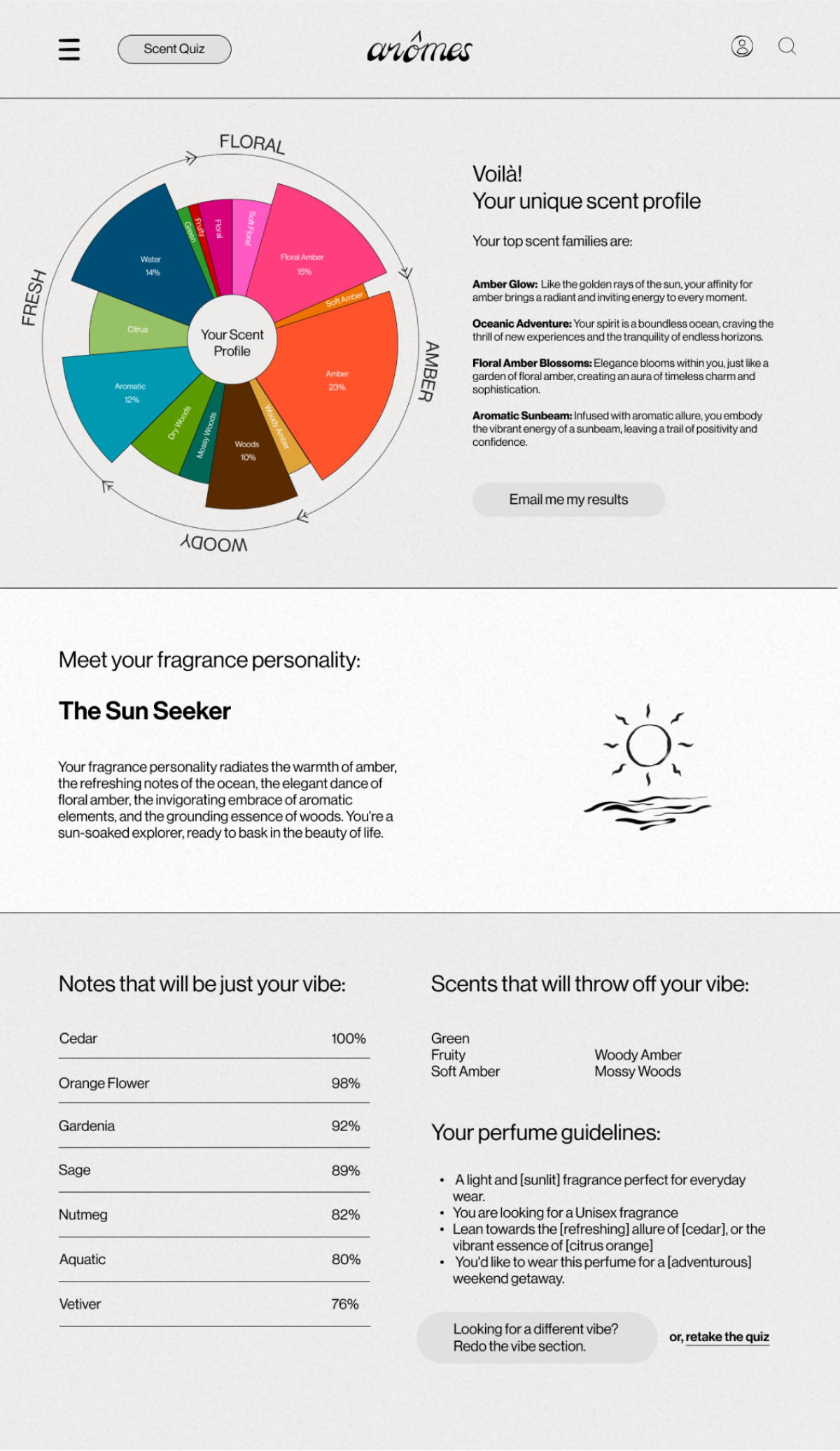
Features added:
Recommendations
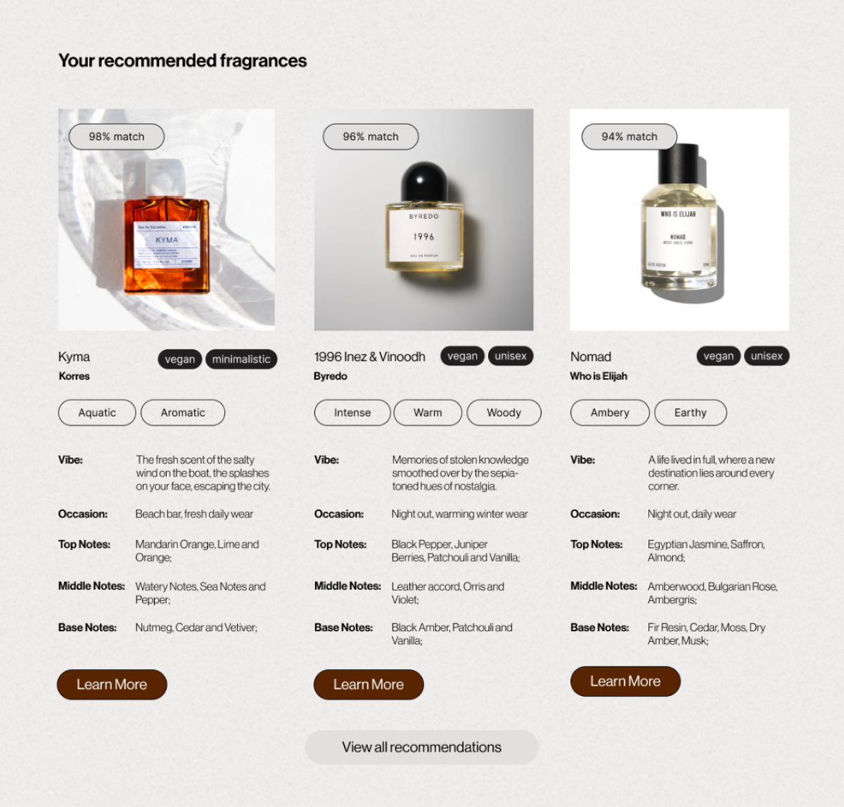
Features added:
Fragrance Page
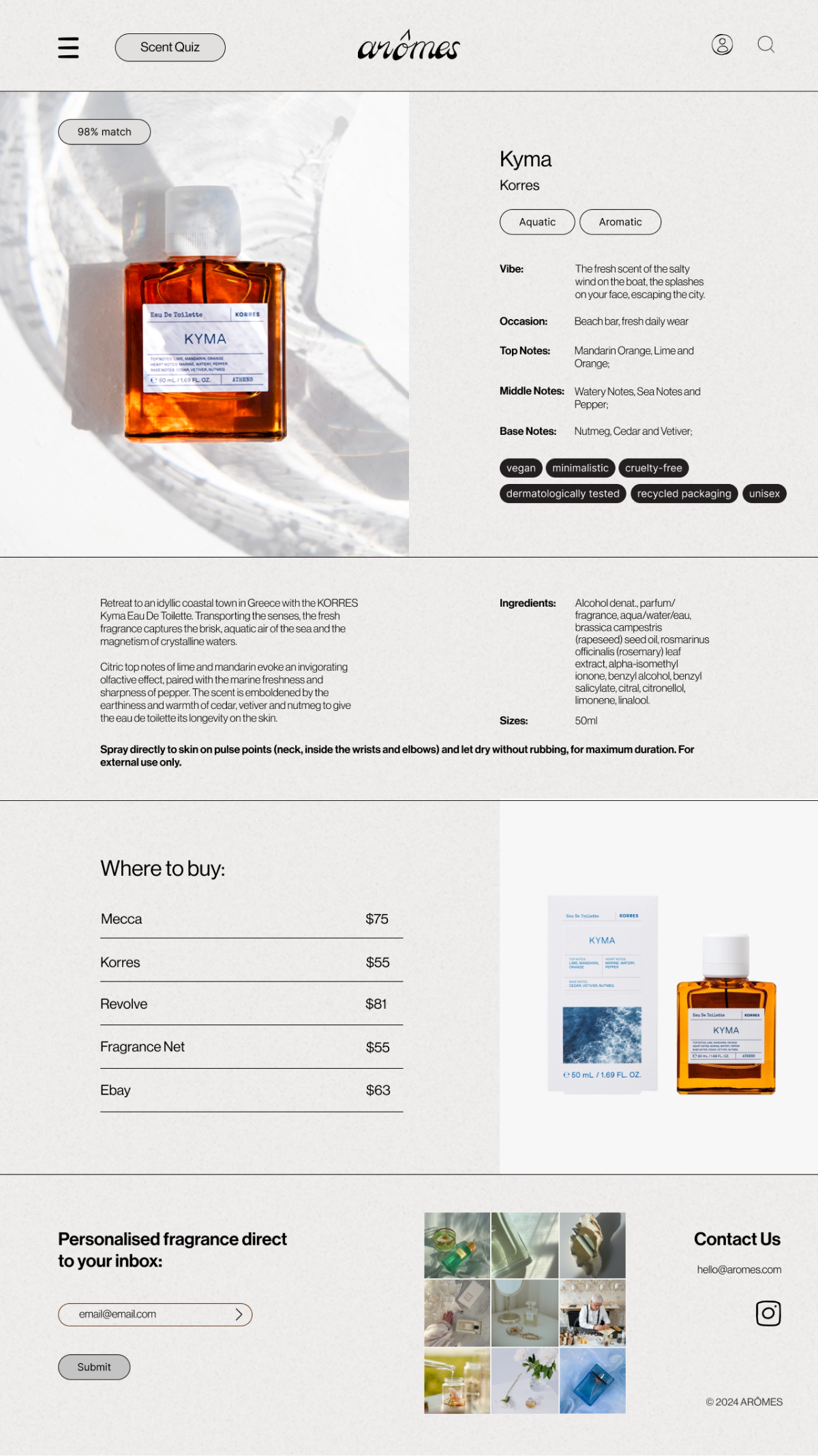
Features added:
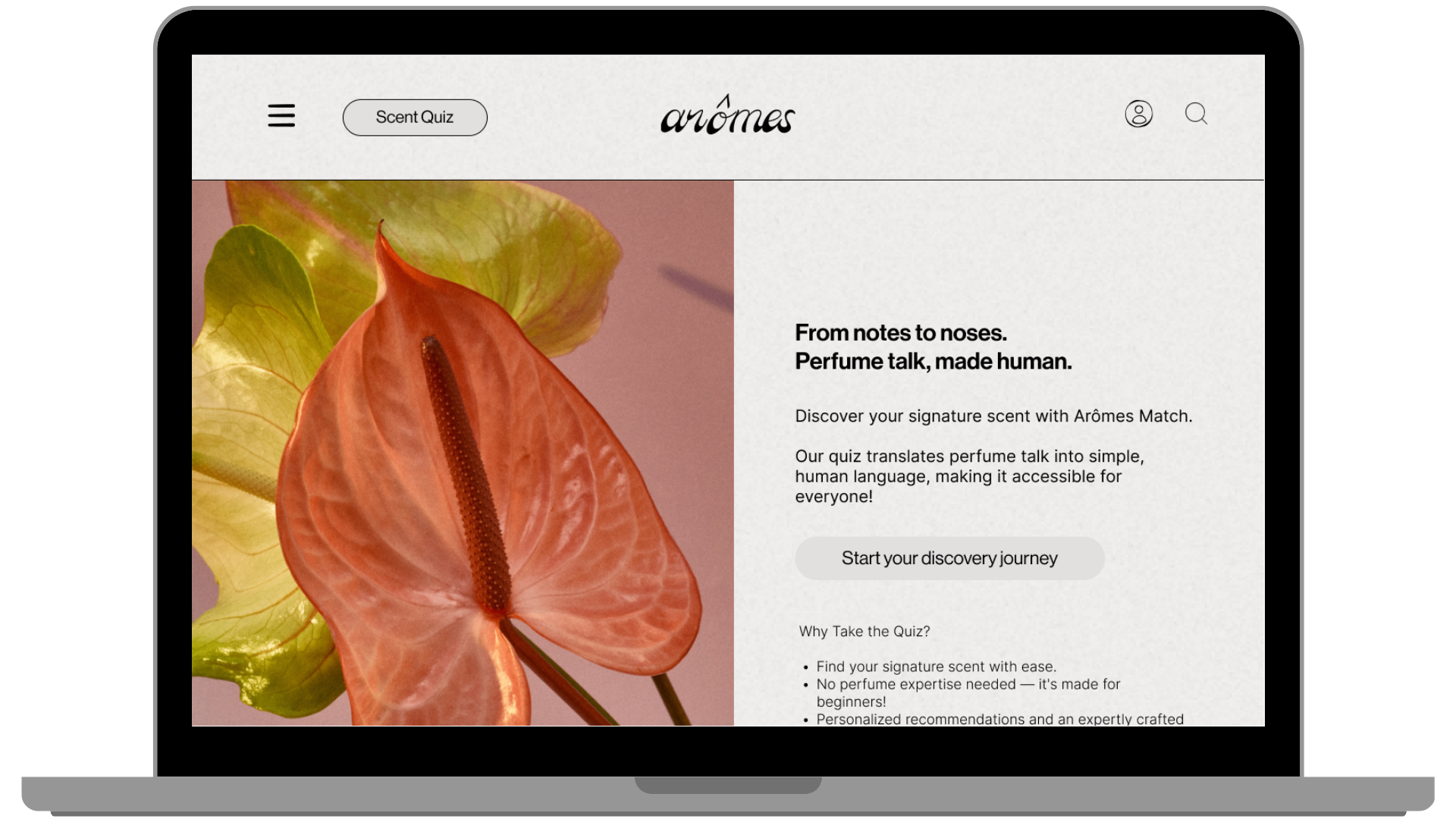
Home Page
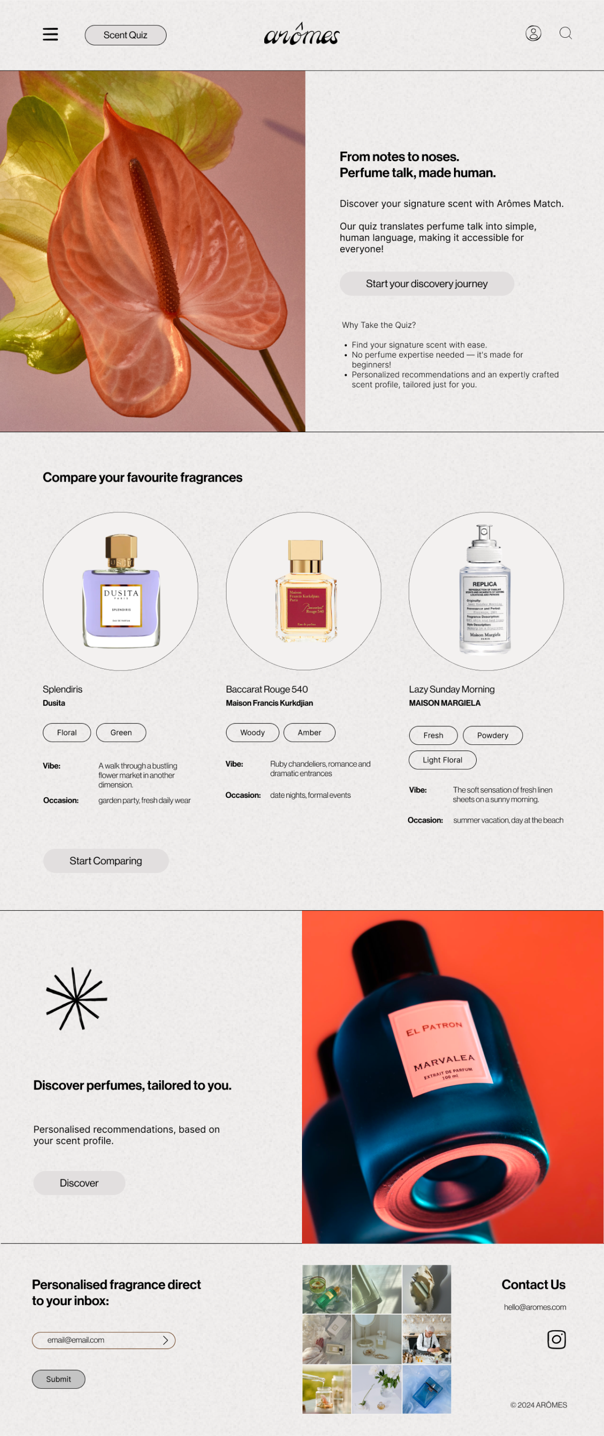
Features added:
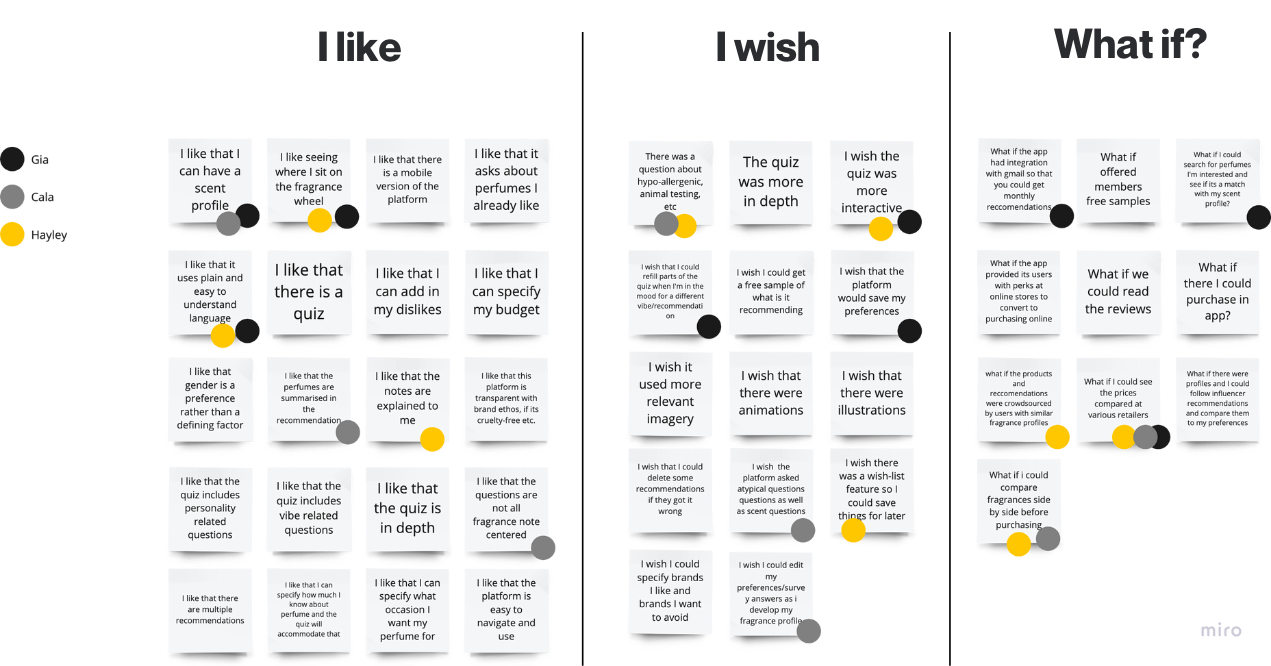
We conducted two rounds of five usability tests with users, using the moderated remote testing methodology via Zoom.
All users were able to complete each task, with the key issue being that they felt the quiz was too long.
Improvement 1: Introducing a progress bar that has a breakdown of sections.
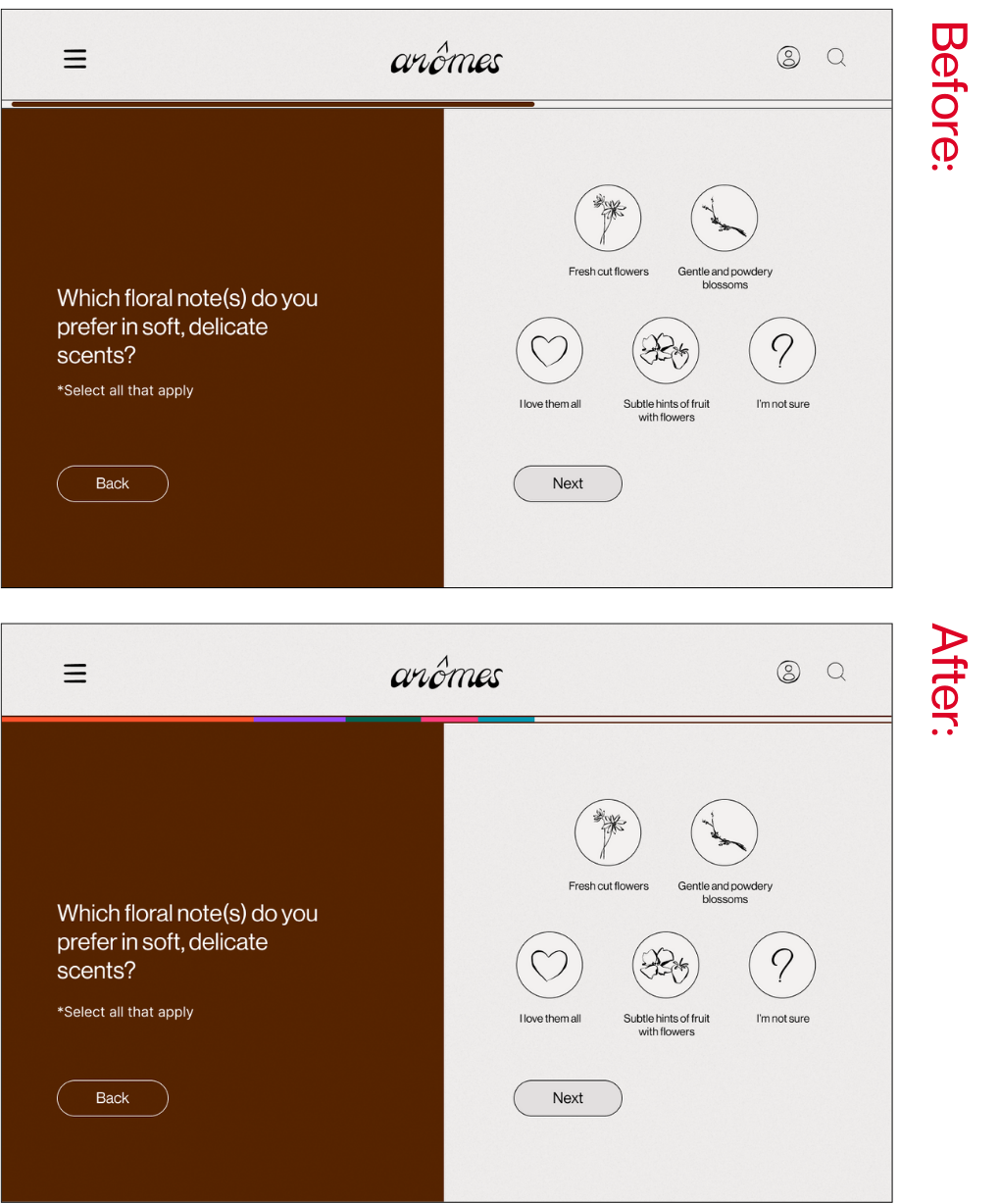
Problem:
The quiz feels long, and users aren’t sure where they are at.
Solution:
Change the progress bar to have colour coded sections, so that users know their progress through the entire quiz and through the sections.
Improvement 2: Break up the quiz by sections, and reward/incentivise users.
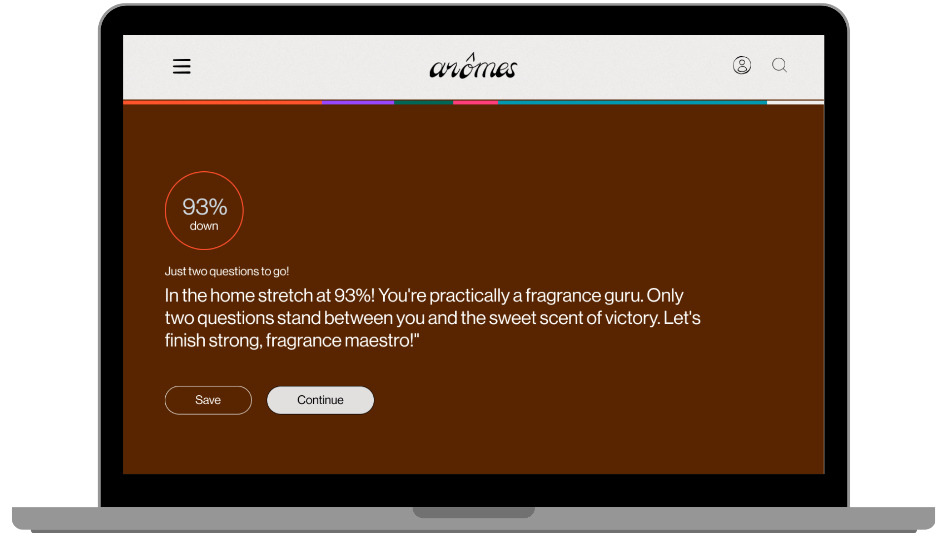
Problem:
Users mentioned that they would like an incentive to continue through the quiz. They felt it was too long and they weren’t aware of their progress/how far they’d come.
Solution:
Added breakpoint screens, let the users know how much they have completed, and used goofy and encouraging language. Added save button, so users can complete later.
Improvement 3: Making the quiz button more prominent
Problem:
A user mentioned wanting easier access to the quiz at all times.
Solution:
Added a ‘Scent Quiz’ button into the header. There are now 3 ways to access the scent quiz.
There is a delicate balance between a quiz being comprehensive and being overwhelming. Further user testing could serve to reveal exactly the point during the quiz where users get fatigued. We had to learn to find a balance between being sophisticated and minimal whilst also being engaging and approachable.
We had so many ideas for features and data to back them up, however we spread ourselves too thin given the time constraints.
Designing a platform for a product that relies so heavily on a sense that cannot be conveyed through technology is extremely difficult. More work could have been done to simplify the jargon, however our limited knowledge on the topic made this task impossible without the help of professionals or the appropriate time to research.
The next steps in this process are to build a wishlist feature for users to create lists under their profiles. Users could create different lists for different occasions and vibes. We’d also like to add search functionality for current brands and fragrances, with information about their scent profile displayed. Additionally, pages about brands and information on their ethics and sustainability are needed so users can make informed decisions about their purchases. A reviews section from past customers would also be informative. Finally, we’d love to create a dedicated dictionary page of scents and jargon words to help users increase their fragrance knowledge. There would also be a ‘more information’ icon over words that might need explaining in the quiz.
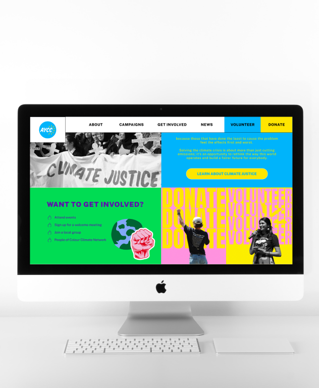
A revamp of the website for the Australian Youth Climate Coalition—a not-for-profit organisation with a powerful mission. Our goal was to infuse the site with a youthful, vibrant energy that resonates loudly and leaves a lasting impact. Join us in this endeavour as we aim to not only enhance the visual appeal but also drive increased volunteer sign-ups, igniting a wave of change in the fight for climate justice.
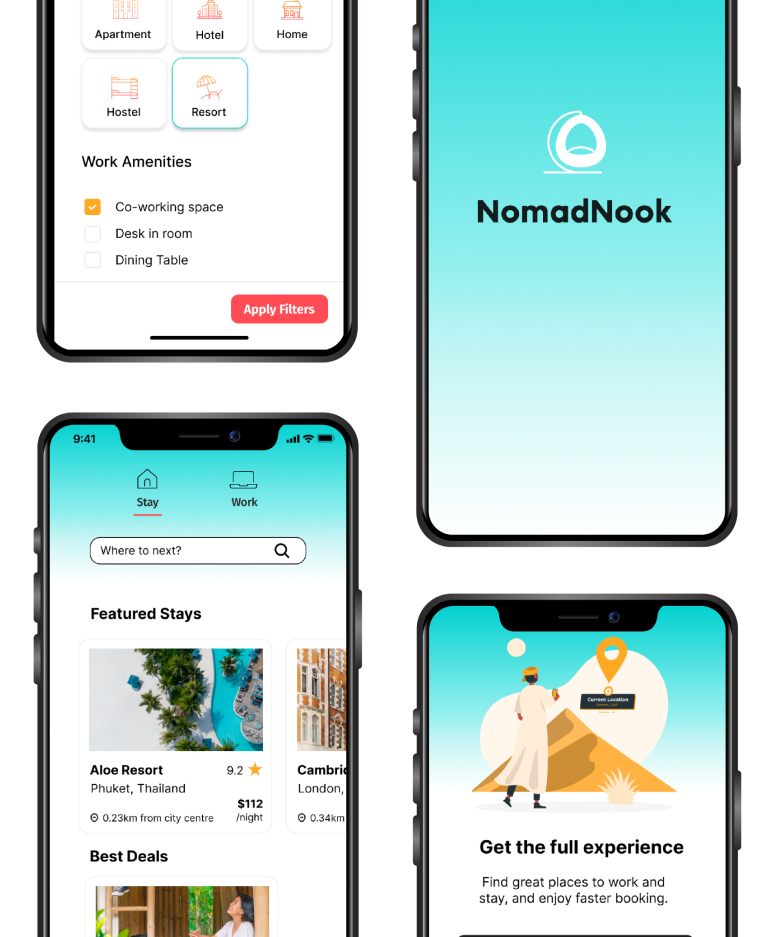
NomadNook is an app designed to elevate the remote working experience. Tailored specifically for digital nomads, NomadNook provides a unique solution for remote workers, offering curated accommodation and third places, recommended by and for fellow remote workers.
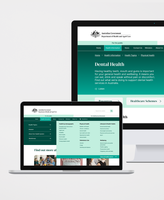
Introducing the redesigned health.gov.au website—a user-centric solution to the navigational challenges plaguing the national health authority's online presence. By reorganising content with intuitive categorisation and employing strategic design elements such as colour, spacing, typography, and imagery, users can now effortlessly locate and digest essential health information.

